


Document Actions
gvSIG-Desktop 1.10. Nuevas funcionalidades
- Leyenda de gráficos
Leyenda de gráficos
Introducción
Chart or diagram legends are intended to provide a visual representation of data in a table, thereby communicating a lot of information very easily.
In particular this extension allows two types of legends to be constructed:
- The first one is represented by circular diagrams known as Pie Charts. The pie chart shows the proportional size of the elements of a data series, based on the sum of its parts, and with each sector representing the value of a particular field. It always shows only one data series and is useful when you want to emphasize a significant element.
- The second type of legend is represented by diagrams known as Bar Charts or Bar Graphs. A bar graph, also known as a column graph, is a diagram containing rectangular bars with lengths proportional to the values they represent. Bar graphs are used to compare two or more values.
Leyenda de tartas
Introducción
The new pie chart legend extends the functionality of existing gvSIG legends, and can be found along with the rest of the legends in the Multiple Attributes section.
Visualización y selección del diagrama de tartas
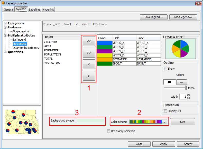
The pie legend is located in the Multiple attributes section of the legend tree, and can be used to represent several attributes at once. To access it, right-click on the layer name to open the Properties and then select the symbols tab.
The following options are available for configuring the pie charts:
Symbols. Pie legend
Fields: You can choose which of the layer's fields to represent, provided they are numeric. With these fields you can:
- Add all fields.
- Delete all fields.
- Add the selected fields.
- Delete the selected fields.
To do this click on the buttons shown in the image above (Box 1).
Colour scheme: You can change the default colour scheme for the pies. To do this select the desired "Colour scheme" from the drop-down list, as shown in the image above (Box 2).
Change the colour: In addition it is possible to change the colour of pie slices once they have been added.
Once the default colour scheme has been chosen, the colour of a pie slice can be changed by double-clicking on its color.
The following dialog is displayed where you can select a colour sample or set it yourself (HSB, RGB).

Symbols. Color Selection
Background symbol: You can change the symbol of the background geometries by clicking on the symbol to open the symbol editor (pictured above, Box 3).

Symbols. Symbol Selector
Outline: You can display an outline with a specified colour and thickness around the pie slices. Tick the "Show" check box to draw outlines around the pie sectors.
Dimension: Tick the check box to display the pie in 3D. By default the pie is drawn in 2D.
Preview chart: Any changes made are reflected on the chart preview.
Opciones del tamaño de los diagramas
Click the 'Size' button located in the pie legend configuration screen.

Pie Legend. Size button
Clicking this will open the following dialog:
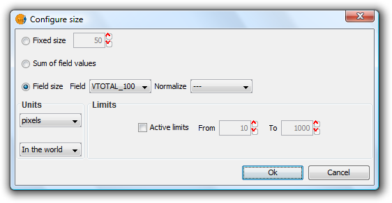
Pie Legend. Configuring size
There are three options for setting the size of the diagrams:
- Fixed Size: All the pie charts will have the size indicated here.
- Sum of field values: The size of the pie charts is obtained from the sum of all the records of the fields making up the chart.
- Field size: The size is obtained from the selected field and can be normalized if so desired.
In addition to setting the size of the pie, the units can also be specified.
Units: Select units (meters, pixels ...) and representation (in the world or print layout), depending on your requirements. If the units are set to "in the world" then the size will depend on the View's zoom level, while selecting "print layout" results in a fixed size, both on the screen and when printed.
Active Limits: Limits can be specified if the size of the chosen field size is not set to the "Fixed Size" option.
Activating limits for the other options sets the minimum and maximum values of a particular measure (Sum of field values or Field size). Taking the limits into account, the intermediate field values are calculated in proportion to the values of the records of the field, or to the sum of the field values.
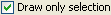
Dibujar diagramas de tartas sólo en las geometrías seleccionadas
This option is used to restrict the drawing of pie charts to selected geometries.
The geometries can be selected either before or after configuring the pie chart size and display options.
In order to represent pie charts for selected geometries, simply activate the check box Draw only selection in the pie legend configuration dialog.
Check to display pie charts for selected geometries only
The following image shows an example in which pie charts are only shown for selected geometries (shown in yellow).
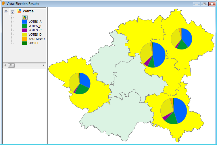
Example showing pie charts for selected geometries
Leyenda de barras
Introducción
The bar chart legend extends the functionality of existing gvSIG legends and can be found, like the pie chart, in the Multiple Attributes section.
Visualización y selección del diagrama de barras
The bar legend is located the Multiple Attributes section of the legend tree, and can be used to represent several attributes at once. To access it, right-click on the layer name to open the Properties, then select the Symbols tab.
The following options are available for configuring bar charts:
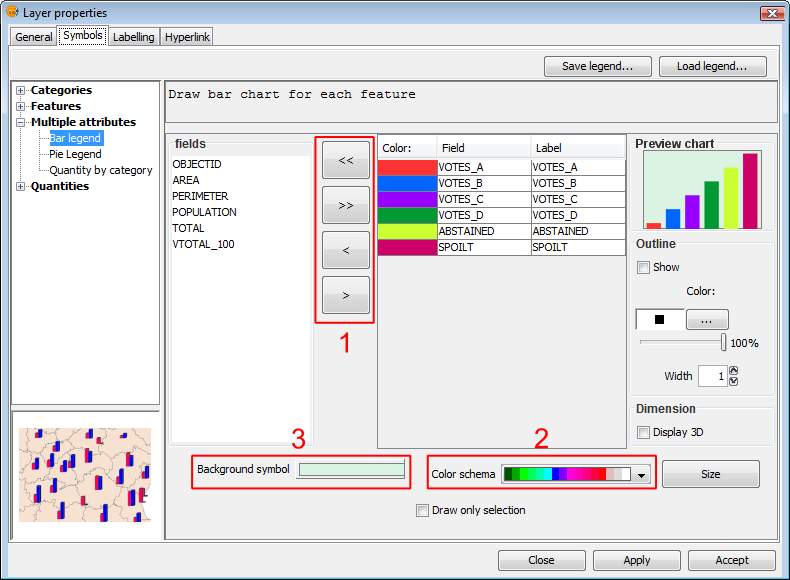
Symbols. Legend bar
Fields: You can choose which of the layer's fields to represent, provided they are numeric. With these fields you can:
- Add all fields.
- Delete all fields.
- Add the selected fields.
- Delete the selected fields.
To do this click on the buttons shown in the image above (Box 1).
Colour scheme: You can change the default colour scheme for the bars. To do this, select the desired "Colour scheme" from the drop-down list, as shown in the image above (Box 2).
Change the colour: In addition it is possible to change the colour of bars once they have been added.
Once the default colour scheme has been chosen, the colour of a bar can be changed by double-clicking on its color tile.
You can use the following dialog to select a colour sample, or set it yourself (HSB, RGB).
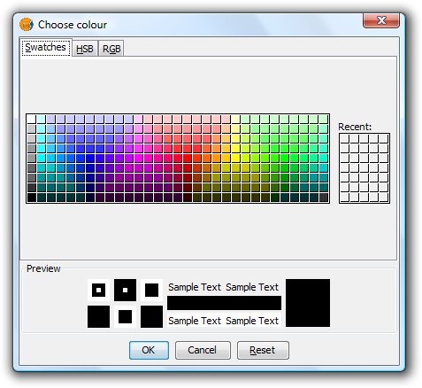
Symbols. Color Selection
Background symbol: You can change the symbol of the background geometries by clicking on the symbol to open the symbol editor (pictured above, Box 3).
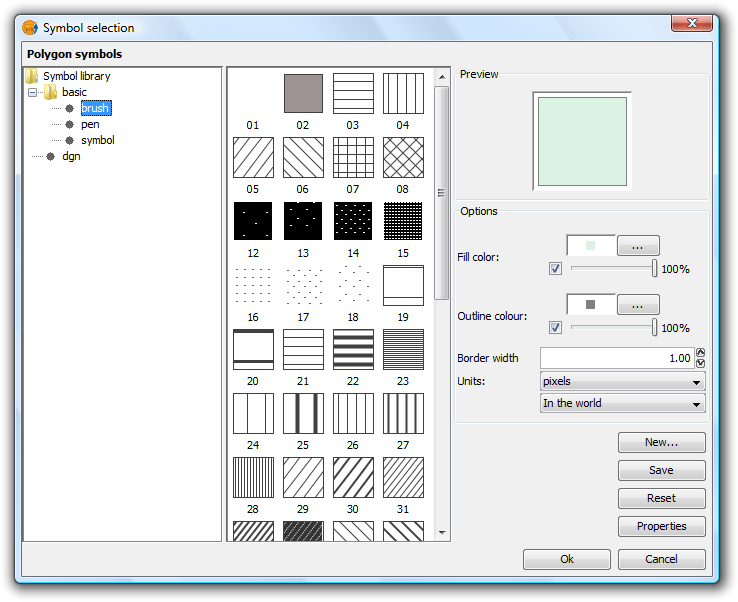
Symbols. Symbol Selector
Outline: You can display an outline with a specified colour and thickness around the bars. Tick the "Show" check box to draw outlines around the bars.
Dimension: Tick the check box to display the bars in 3D. By default the bars are drawn in 2D.
Preview chart: Any changes made are reflected on the chart preview.
Opciones del tamaño de los diagramas
Click the 'Size' button located in the bar legend configuration screen.

Bar Legend. Size button
Clicking this will open the following dialog:

Bar Legend. Configuring size
There are three options for setting the size of the diagrams:
- Fixed Size: The largest bar will drawn to this size, and the rest will be drawn proportionately.
- Sum of field values: The size of the bars will be determined by the sum of all the records in the fields making up the chart.
- Field size: The size is obtained from the selected field and can be normalized if so desired. For example, a chart could be drawn to represent the number of votes for each political party by the size of the bar, while the overall size of the diagram could be determined by another field, such as number of habitants. In this example, the size of the graph would be larger for areas of greater population.
In addition to setting the size of the bars, the units can also be specified.
Units: Select units (meters, pixels ...) and representation (in the world or print layout), depending on your requirements. If the units are set to "in the world" then the size will depend on the View's zoom level, while selecting "print layout" results in a fixed size, both on the screen and when printed.
Active Limits: Limits can be specified if the size of the chosen field size is not set to the "Fixed Size" option.
Activating limits for the other options sets the minimum and maximum values of a particular measure (Sum of field values or Field size). Taking the limits into account, the intermediate field values are calculated in proportion to the values of the records of the field, or to the sum of the field values.
Dibujar diagramas de barras sólo en las geometrías seleccionadas
This option is used to restrict the drawing of bar charts to selected geometries.
The geometries can be selected either before or after configuring the bar chart size and display options.
In order to display bar charts for selected geometries, simply tick the check box “Draw only selection” in the pie legend configuration dialog.

Check to display bar charts for selected geometries only
The following image shows an example in which bar charts are only shown for selected geometries (shown in yellow).
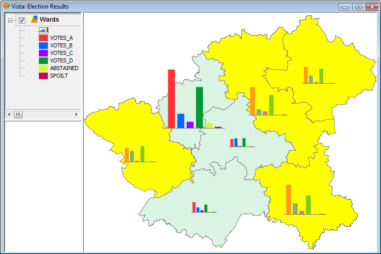
Example showing bar charts for selected geometries


